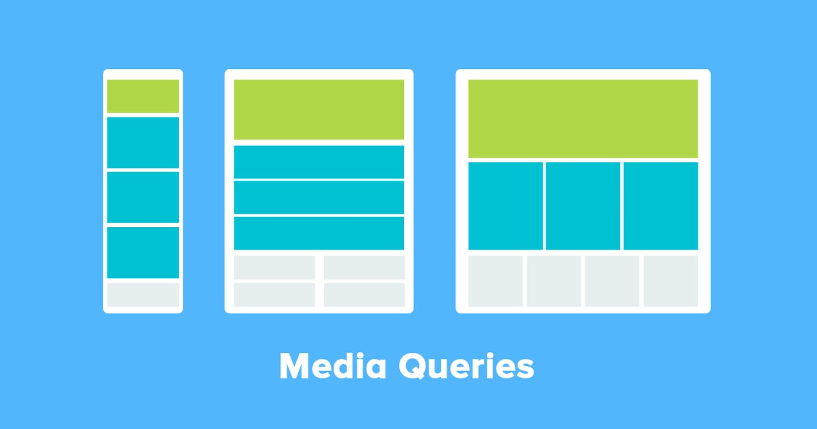
It is very important to be able to design a website whose contents looks good on all screen sizes
###What Exactly Is Responsive Design? Responsive Design is the process of making your web content fit all screen sizes (ranging from mobile phones to large screens like desktop screen and much bigger screen). Every element or component on the site should be able to automatically adapt to the specific devices that opens the website.
An important thing to look at when we talk about responsive web design is media queries.
###What Then Is Media Queries? In CSS, a media query is used to apply a set of styles based on the browser's characteristics including width, height, or screen resolution. This allows the programmer to provide certain features on each devices, Thus you may see a search bar on larger screens but only a search button on a smaller screen.
###Media Query Syntax This is the basic syntax for a media query in CSS
@media media-type(media-feature){
  /*styles go here*/
}
Let's try to understand the syntax above, The @media is a type of At-rule in CSS. These rules will dictate what the CSS will look based on certain conditions.
The media-type refers to the category of media for the device. The different media types include all, print, screen and speech.
all- works for all devicesprint- works for devices where the media is in print preview modescreen- works for devices with screensspeech- works for devices like screen readers where the content is read out loud to the user.
According to documentation, Except when using the
notoronlylogical operators, the media-type is optional and thealltype is implied.
You can choose to omit the media-type and use the following syntax instead,
@media (media-feature){
  /*styles go here*/
}
If you want to create more complex media queries, then you can use logical operators like and, not or ,.
###Devices and Their Width
- Mobile Devices : 320px - 480px
- Ipads, Tablets : 481px - 768px
- Small Screens, Laptop : 769px - 1024px
- Desktops, Large Screens : 1025px - 1200px
- Extra Large Screens,TV's : 1201px and more
####Examples
If we want to change the background color of a website to blue for only mobile devices and tablets, we will use the code below
@media (max-width: 768px){
  body{
    background-color: blue;
  }
}
###Conclusion If you want your website to look good and also to be able to run on more devices, then responsive design is a necessity for you. Thank you for taking your time to read this article.
Please follow Me On:
by clicking on the link for more tech inspired tweets, articles and more...

